Magicians casting strange spells, terrifying horsemen, tentacular creatures or other skeletons equipped with scythes… The covers of the Books of which you are the hero have marked more than one player, in particular because their drawings contrasted with the more classic childish illustrations. “The illustrators of the time were not illustrators for children, they could sometimes be a little violent”, points out Florent Haro, director Scriptarium editions .
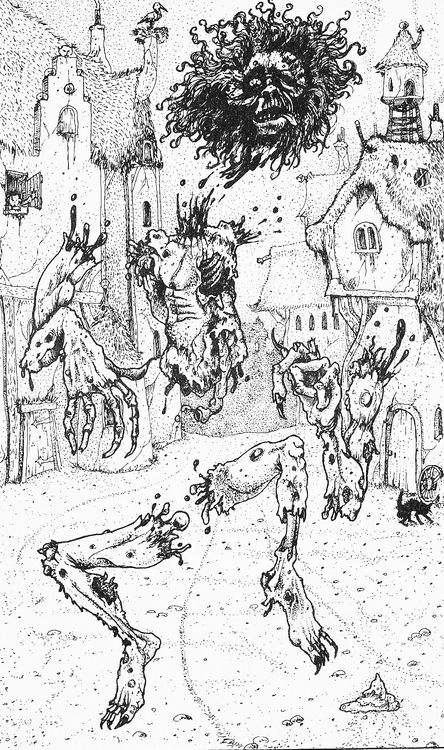
To these covers are added the illustrations scattered over the pages of each Book of which you are the hero, often the work of a second illustrator. “The illustrations are part of the atmosphere, they set a particular decor, a style. Without them, the spirit of some LDVELH would no longer be the same. Sometimes they even have a small role in terms of the game, certain elements are hidden in the illustration, like numbers that refer to the text for example”.
“It’s all the more interesting that at the time, we were in punk England, and we finally had a product that was a little scary”, tells you FibreTigre. “The illustrations are fantasy, but there are also zombies, corpses… When you open a Book in which you are the hero, you can be devoured by a dinosaur. Children love these slightly gory illustrations. Especially since, very quickly, the parents say “Ouh la la it’s not for you”. Which makes it even more of a loss leader, because when you forbid something to a child, he wants it even more…”.

Illustrators like Peter Andrew Jones (who did the cover for the Wizard of Fire Mountain), John Blanche (Witchcraft!) or even John Howe (The Quest for the Grail) marked a generation of kids, wide-eyed before drawings that promised them dark and mysterious adventures.
“In my eyes, the singularity of the illustrations of the LDVELH is linked to their role in the desire to read the book again”, tells you Laurent Centro, Director of Alkonost editions. “Anyone who has read a book of this type has necessarily taken stock, at the end, of the illustrations not encountered during the game. With their mystery, they are so many invitations to replay the book by following new paths. This is why authors, illustrators and publishers generally take care not to illustrate only the obligatory passages or key scenes.
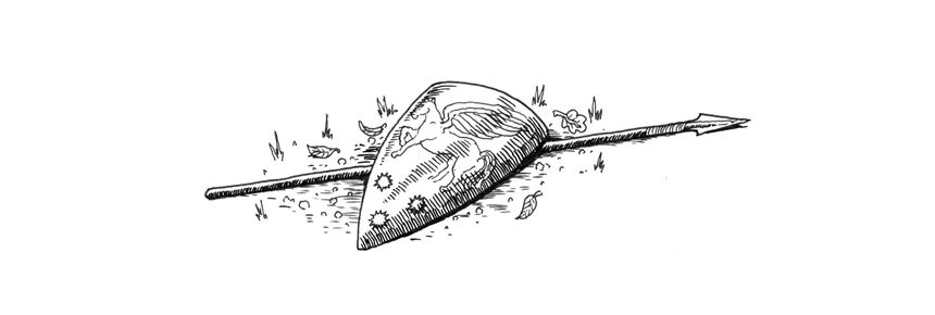
In addition to the classic illustrations, often full-page, it is not uncommon to come across small illustrations, such as a skull, a small creature or even a rusty sword, which regularly adorn the text: “These are images that are necessary”, FibreTigre tells you. “When you lay out a Book in which you are the hero and you have paragraphs separated by a number, you have a lot of widows and orphans, that is to say isolated lines of text on the page To adjust, you need thumbnails of different sizes that allow you to play with the format. With all these little illuminations, these little devils in the corners, the end result is books that look a bit like the magic grimoires of fairy tales! ”.

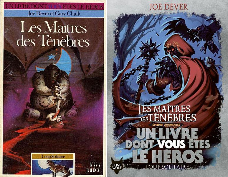
Since 2018, the reissues of the different collections, at Gallimard, have offered new, much more colorful covers, which divide LDVELH enthusiasts. The English publisher, Scholastic, which succeeded Puffin Books, chose covers closer to a comic book style, in order to reach a wider audience.
“There is no longer really this mysterious side, bordering on violent, very black, very dark, that it could have had”, considers Florent Haro. “There were things that could be impressive for a young readership, but it was part of the sulphurous and mysterious side. But these new covers do not only have drawbacks: “We help by suggesting ideas to the publisher that are related to the content; there have also often been, in the history of the range, covers that had no connection with the story”.

“It’s true that the latest graphic makeover marks a stronger dropout than the previous ones”, confirms Aurélie Pregliasco, literary director at Gallimard jeunesse. “In the first books we used the new illustrations from Scholastic and then afterwards we made our own covers. But historical illustrations [dans les livres] were so much more beautiful, so much fairer and so loved by the fans that we went back. We kept this very different line for the cover, but inside the historical illustrations were cult, so we kept them”.
We want to say thanks to the author of this write-up for this remarkable content
3. Gamebook illustrations
Discover our social media profiles and other related pageshttps://nimblespirit.com/related-pages/
